Can You See the Story?

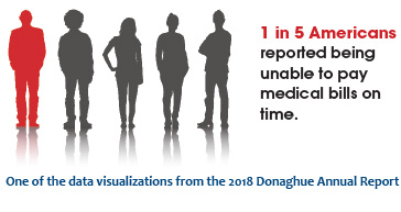
In October Donaghue, along with the Health ResearchAlliance and HealthDataViz, sponsored a webinar “You Have the Data But Can You See the Story?” on using data visualization to enhance communication skills.
The goal of the webinar was to offer guidance on best practices for creating and distributing visualizations, present examples of different data visualizations that are most relevant to clinical and health services researchers, and recommend other resources for those who want to continue learning about using visualization to communicate their work.
Developing and offering this webinar was part of Donaghue’s ongoing effort to provide additional resources to its grantees, to increase the impact of its awards, and to develop collaborative relationships with organizations who share a similar mission with Donaghue.
The webinar was aimed at researchers and health research funders who currently have a limited experience with data visualizations but want to use it to enhance descriptions of their data and findings. Ninety-five individuals participated in the webinar, including a diverse mix of past and current Donaghue grantees, stakeholders and reviewers from Donaghue grant programs, and representatives from Health Research Alliance member organizations. The evaluations indicated that most participants agreed that the webinar was a good use of their time and that it provided a useful introductory overview to creating and using data visualizations. In fact, several participants indicated that they would want a second, more in-depth webinar, so another data viz webinar is being planned for early 2019.
The webinar and accompanying slide deck can be accessed at healthra.org/resources.